Did you know that you can navigate the posts by swiping left and right?
How to Write Word Documents That Don't Suck
02 Oct 2016
. category:
.
Comments
If you’re using a computer, chances are pretty good that you’re using Microsoft Word for something or the other. Chances are also pretty good that you’re not that happy with the output of some of your labors in the document. Fear not, brave reader! It is very much possible to create Word documents that don’t suck to look at.
Why Do Your Documents Suck?
When I say “document”, I mean something that has more than one page, and takes longer than a minute or two to read. Also, I classify a document as a piece of writing other people may need to read. There, now that I’ve got that out of the way, there’s a handful of reasons why documents tend to suck.
- They’re formatted inconsistently, and are hard to follow.
- They don’t answer a lot of the questions which they should.
- They just look ugly–a mishmash of fonts and styles.
Look, it’s not your fault. You don’t mean to create documents that suck. It’s just something that happens, typically when there’s a lack of planning and/or a focus on the wrong things. Don’t worry, I’m here to help!
Vishal’s Five Rules of Word Documents
Let’s list the rules first, then go over them in practice. I’m going to cover Word 2013 for Mac, but my advice can easily cover Word going as far back as 2007. If you’re using a version of Office/Word older than that, you may need more help than I can give you.
- Don’t Play With Fonts or Spacing Until You’re Done Writing
- Build Your Document Using Styles, not Fonts
- Break Your Document Into Sections First
- Sometimes it’s Better to be Understated
- Let Word Do the Majority of the Work
Rule #1: Don’t Play With Fonts or Spacing Until You’re Done Writing
Wait, what?! This may be a hard one for some people to grasp, but it’s the first rule on the board for a reason. It’s second nature to pick your fonts and spacings and page borders before you start writing. This only wastes time, and it makes even more work for you later on if you decide you want to change something. Get your content into Word first, then try adjusting things.
There’s a couple of advantages to doing this. First, you get to the business of thinking of what you need to write much faster. Second, if it’s something you’re writing for a job, you can show progress against your task much faster (making you look good). But most importantly, you get the ickiest part of working with Word out of the way upfront–actually writing the damn thing.
What’s that? I hear you ask, but Vishal, how will I be able to change the fonts and spacing afterwards? I can understand the confusion. Won’t it be more work to select everything and set the fonts later? NO! Allow me to introduce the next concept to you…
Rule #2: Build Your Document Using Styles, not Fonts
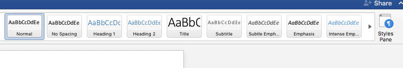
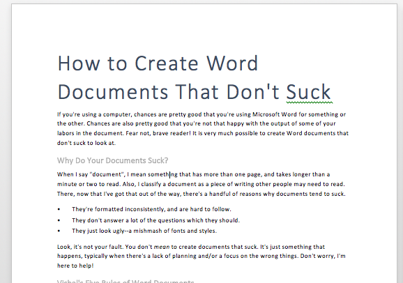
You see that above? How many times do you use it? The correct answer should be every time you write a Word Document. This is the Styles palette. These styles are your ticket to quickly changing the way the document looks with a few clicks. For example, here’s a document where I’ve used the default styles to create headings and some text. Looks kind of bland, right?
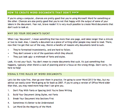
Well, we won’t stand for that. Since we used the styles as we wrote, we can change the way the whole document looks on the fly, just by selecting a different Style Set. A Style Set is simply a collection of styles (heading and body text) that go together. By clicking on the Design ribbon, we can choose from any number of style sets.
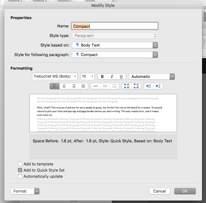
Wow! That’s probably a little too exciting for the annual report, huh? No problem. We can switch back to the original style set, and tweak the styles to get what we want. All you need to do is right-click on the style you want to change, then select Modify Style. A nifty dialog will pop up letting you change the font and paragraph spacing. If this seems a little too overwhelming for you, don’t worry! You should find something close enough to what you want.
So now you see–if you use the headings and other styles from the outset, no matter how ugly they are, you can easily change them when you’re done writing. And the best part is that your changes are uniform. That is to say, if you change a style, every piece of text using it will change, too.
Rule #3: Break Your Document Into Sections First
Let’s go back to your grade school training. What was the first thing you needed to do when you set out to write something? Outline it. Shocker! That principle will help you write good documents, even now. Something as simple as this does the trick:
- Why Do Your Documents Suck?
- Vishal’s Six Rules of Word Documents
- Rule #1: Don’t Play With Fonts or Spacing Until You’re Done Writing
- Rule #2: Build Your Document Using Styles, not Fonts
- Rule #3: Break Your Document Into Sections First
- Rule #4: Sometimes it’s Better to be Understated
- Rule #5: Let Word Do the Majority of the Work
- Closing
Boy, that looks familiar!
Once you have an outline, type it out using the headings in the style palette. Match the level in your outline to the right heading. For example, the first level (“Why Do Your Documents Suck?”, etc.) should be written using Heading 1. The second level (“Rule #1…”, etc) should be written using Heading 2, and so on and so forth.
There’s a couple of benefits to writing your documents this way. First, you work out what you need to say before you start writing it. Second, you end up with a document that flows well and is easy to read. This shouldn’t be a surprise–if you spend the time planning a document, it pays dividends. Third, and probably most importantly, you know how long you have left before you’re done with the stupid thing. That alone should make it worth it.
Rule #4: Sometimes it’s Better to be Understated
Look. I know you’re a creative soul at heart. I know you’ve got that really, really cute font you like to use, and you love playing with bright colors like blue, green, and pink. You know, colors that “pop” (whatever that means). However, I’ve got a plea on behalf of anyone that will ever read what you’re writing: please don’t.
I can understand the need to change things up, to try something unique. But consider that the stuff that’s clichéd is clichéd for a reason–it works. Feel free to change your styles away from the defaults, but remember that you’re writing something other people will need to read. Consider the following guidelines as you make design decisions.
- Serif fonts (like Times New Roman, Cambria, etc.) are popular because they’re easy to read, especially on a printed page.
- Headers should stand out compared to the body text (e.g. boldface, different type)
- The font size should decrease as the heading number increases. That is, Heading 2 should have a smaller font size than Header 1, and so on and so forth.
- Indentation between paragraphs is optional, but the spacing between paragraphs makes the document more readable (so don’t get rid of it).
- Your favorite colors might look great on a shirt or a bag, but they may not look so great on your document. If you’re going to be bold with your colors, make sure there’s enough contrast between your foreground and background.
There’s no harm in making documents that aren’t “boring looking”. Just recognize that they’re like seasonings in stew–subtlety is king.
Rule #5: Let Word Do the Majority of the Work
This is a more generic point, but it’s worth belaboring. It’s very easy to get obsessed with the minutiae in a document. Trust me, as someone who’s done his fair share of CSS work, I can empathize. But you’ve got to trust me when I say: leave the defaults be. The reason for this is fairly simple. Word puts in a lot of work to automatically style itself. While it’s really easy to mess with the settings, it’s really hard to fix it should you make a mess. For the most part, trust the defaults and use a mix of style sets and color themes to get a look you’ll be happy with.
Closing
And that’s how you can learn to master Word documents. It’s super easy! Did you learn something nifty? Good. Because next time, I’m going to show you how you can use these same principles to remove Word from your life entirely. Muahaha! See you next time.

Vishal Kotcherlakota is a reformed sysadmin, who writes code and will talk incessantly about DevOps to anyone who will listen. All views expressed here are his and not those of his employers.